Geog 3053 (4) Geographic Information Science: Mapping - University of Colorado
Image ID: 1280
Image ID: 1274
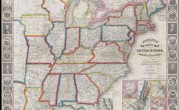
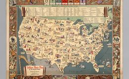
Who are the people shown on this border and what are the symbols shown? Do these elements add to the meaning and the effectiveness of the map?
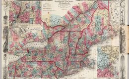
Zoom way in to this area. What is the content of the body of this map? What features are shown and what features are not shown and can you figure out why?
Image ID: 1282
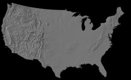
This map has no labels, cultural data or boundaries. Would adding those things help you interpret the map? What do you think the purpose of this map is?
Image ID: 1283
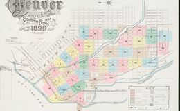
This map is quite busy, between the mismatched elements that make the border, the main map's placement on the page, and the inset maps. What could be done to make it easier on your eyes?
Note border details. Someone got a little excited adding printing plates.
Image ID: 1128
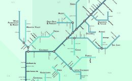
This map shows the Colorado River and its tributaries in a unique way -- as a subway map. Is this map understandable to you? Does its method of conveying information make sense or is it confusing?
Image ID: 1284
Where in the world is this? Is this an effective way to influence your audience about the dangers of drinking?
Image ID: 1126
Best compass rose design ever!
Image ID: 1276
What do you think of the typeface on this map?
Image ID: 1277
Consider the content of this map and the time period in which it was created. Do you think the illustrations would have been understanding and appealing for that era?
Image ID: 1278
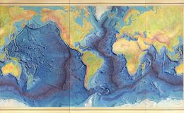
Relief on this map is shown in a variety of ways - trough shading and gradient tints and landform drawings. Is it clear to you?
Image ID: 1279
What do you think of this compass rose? Think about the era in which the map was made.
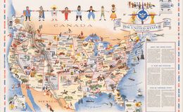
What do you think the authors of this map are conveying by having everyone hold hands across cultures?
Image ID: 1281
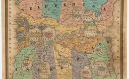
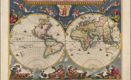
What does this level of grandeur in a decorative border say about the world? Who do you think owned or was able to view a map such as this in the 17th century?
What mapping mistake do you see here? [ZOOM IN]
Do you see other areas not fully explored?